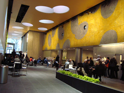
David Rubenstein Atrium at Lincoln Center; Tod Williams Billie Tsien Architects
Many New Yorkers have a Love/Hate relationship with Lincoln Center. But we want to love it, and so keep coming back even though it sometimes disappoints us (as Miss Tully has done again and again).
I am counting on a metronome swing far into the love side with the opening of the new David Rubenstein Atrium at Lincoln Center.
This prime location started life as a bonus plaza, a well intentioned but seriously abused zoning program allowing higher, bulkier ugliness in one of the ugliest buildings in the Lincoln Square neighborhood, the Harmony Building (designed by Philip Birnbaum, and completed in 1978). The original dismal space, a T-shaped “arcade” connecting Broadway, Columbus Ave and 62nd Street, always seemed severely neglected, and lack of use by the pedestrian public allowed it to become a haven for the neighborhood homeless. For a while a climbing wall was added and brought some youth activity, but after a few years the novelty wore off as teens and tikes together turned their attention to texting, and the operator closed. The ugly tarp over the wall to prevent unharnessed climbing added to the torn and tattered ambiance.
Not sure of what deals were worked out by all the involved parties, and disappointed with the way Alice Tully Hall lobby and café 65 are being managed, (which is not a bonus plaza space) I feared some sort of sneaky removal of bonus plaza status in exchange for renovation and upkeep. I am happy to report that is not the case.
Photos and more, after the jump.
This theme is carried over into the major artwork on the south wall of the atrium space, a “wall painting” made with colored felt by Dutch textile designer Claudy Jongstra, where the circular shape gets elongated into an ellipse, repeating across a pleasing warm yellow background.
There are two “vertical garden” plant walls, green Ab-Ex murals anchoring each main axis entrance. I’ll admit that I thought these plants looked fake when I peered through the peeling vinyl glass masking as construction neared completion, but they are very much alive. If you look closely, the support structure and hydration system behind the plants seems to echoes the old climbing wall in miniature. Evidently, sitting next to one of these plant-Pollacks is pleasantly soothing.
Bizarre may be the best word to describe the floor to ceiling water feature. Stainless steel rods of varying lengths hang from the ceiling where water gently drips down, into and between twelve upturned stainless steel light canisters below. Four-inch high mini-jets of water shoot up occasionally from the rectangular collecting pool, raising and lowering the water sound level. As people are wont to do, coins (mostly pennies) are tossed, some landing inside the light canisters with a clank, prize winning throws in a POPS carnival game.
Simple but comfortable tables and chairs are moveable, and so far seem plentiful; at least one table has always been open when I visited. This may change as word gets out, and as patrons of the overcrowded Starbucks two doors down realize they can sip n’ schmooze in much greater comfort here. If you’re not bringing your own food, this is also the newest location of ‘witchcraft. Although I have read plenty of good press, I have not yet eaten at one. That will change soon; the menu looks quite tasty, with reasonable prices by NYC standards.
Like all of Lincoln Center, the wi-fi is free, but electricity is not; bring plenty of your own battery power.
Some other amenities include the box office, (not yet open), free live performances (a minimum of one a week), a large blank video screen wall that cycles through an animated but not distracting list of current and upcoming Lincoln Center attractions, and (shhh…) public restrooms.
There are also some computer stations that allow you to order tickets on-line, browse the Lincoln Center website, and view interactive wayfinding maps to help guide you to your event’s location, which could range from the Jazz clubs in Time Warner Center three blocks south, to the smaller theaters and rehearsal spaces three blocks north along 65th Street.
These maps would be helpful, but in a typical oversight of wayfinding planning, they remain oriented as originally created for an off-site viewer, instead of being rotated 180 degrees, which would align them correctly when using them in the space (the computer stations are on the south wall, the maps, as is usually correct, have north at the top). This may be no big deal to a map savvy local, but I guarantee that every single non-local will attempt to follow the computer-planned path exactly opposite of the correct direction.
The best public spaces should attract and serve a wide variety of people, and my initial observations are promising. Younger singles on computers, multi-generational (and multi-table using) families, a trio of middle-aged women, a grandfather happily leading his granddaughter around, and yes, even some homeless men have all been part of the population on three different visits. I look forward to frequently enjoying this currently delightful public space.


The vertical wall is well done.
ReplyDeleteLushe
www.lushe.com.au
I was initially excited by the Cafe 65 space as well, but recent experiences make me suspect I share your opinion on the management. I'm delighted to know about this space though; I'm always on the look out for free indoor spaces to linger in. They're a rarity in NYC, for obvious reasons. I'll have to get down there before the Starbucks crowd discovers it.
ReplyDelete